Visual Identity | Brand | Logo Design
JRCo
A BRAND THAT BLENDS FINANCE AND FEELING
An identity that hits all the right notes
When Joe Roughton got in touch to rebrand his finance business, we knew straight away this wasn’t going to be your standard blue-and-grey corporate borefest.
Working in partnership with the excellent Lisa Summerscales at McLaren & Co Marketing, we helped Joe evolve his business into JRCo – a brand that reflects what he does, but also who he is. Joe’s great with numbers, but he’s also a massive music fan.

Numbers and notes
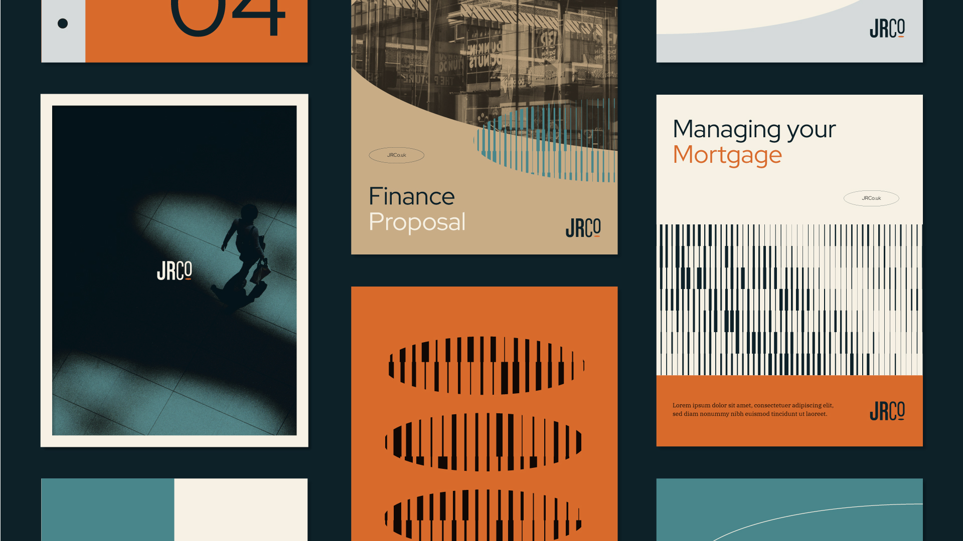
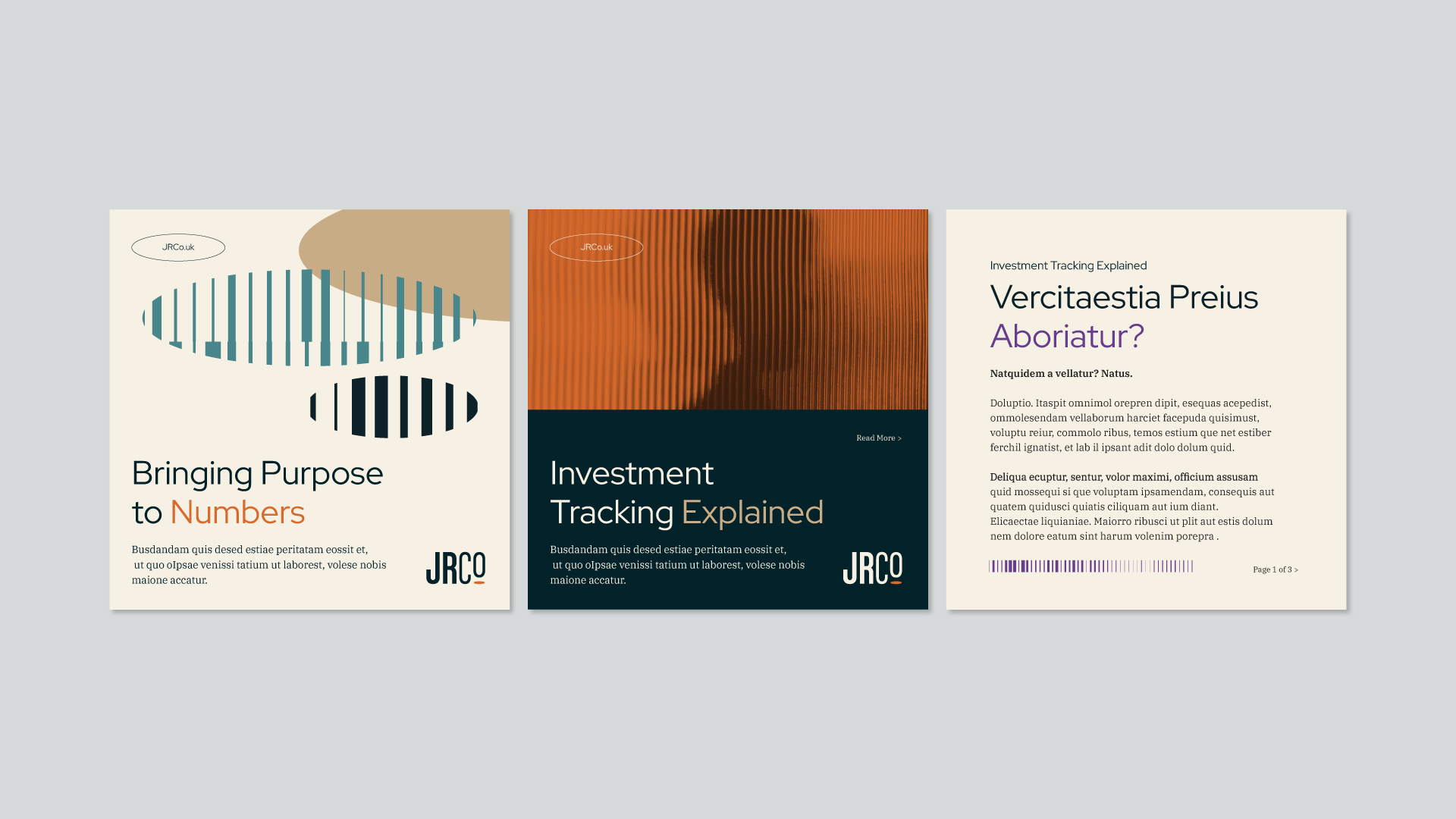
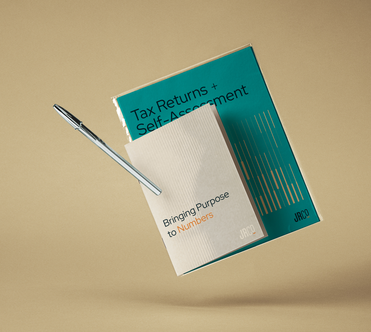
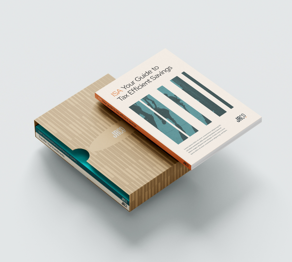
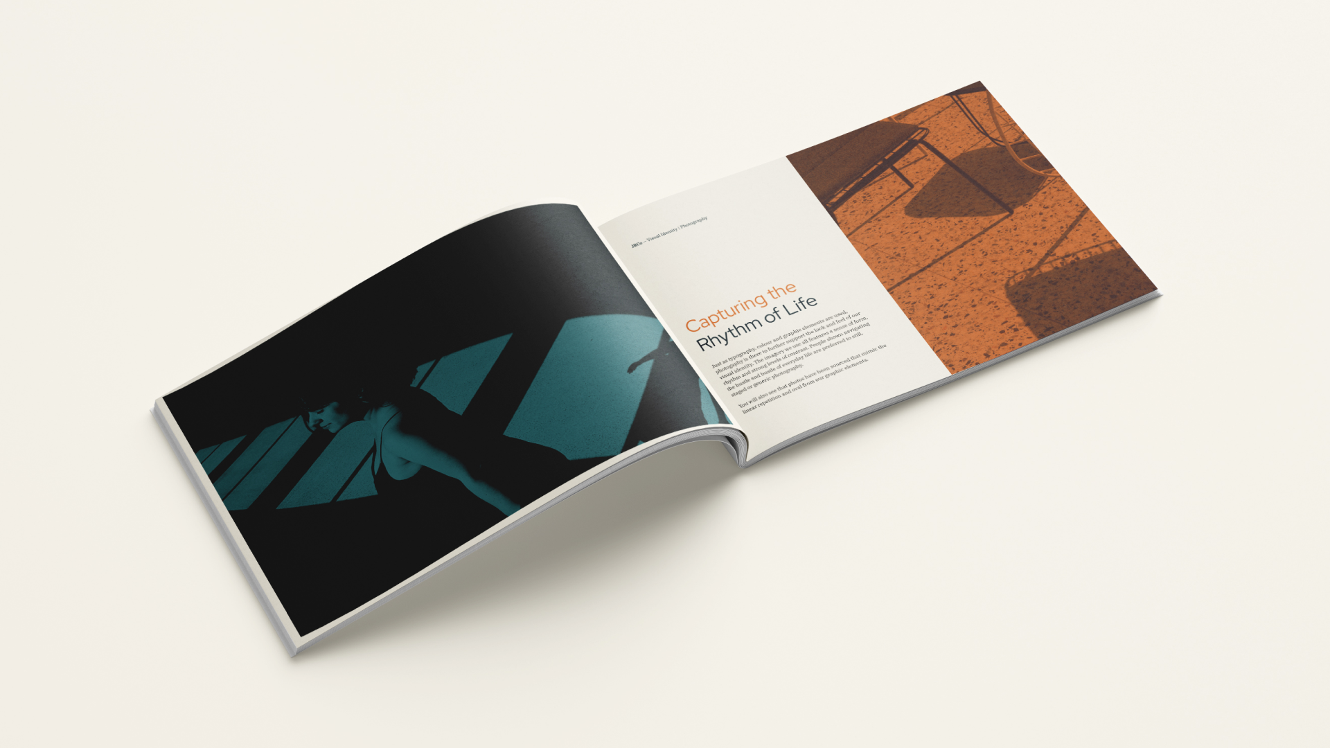
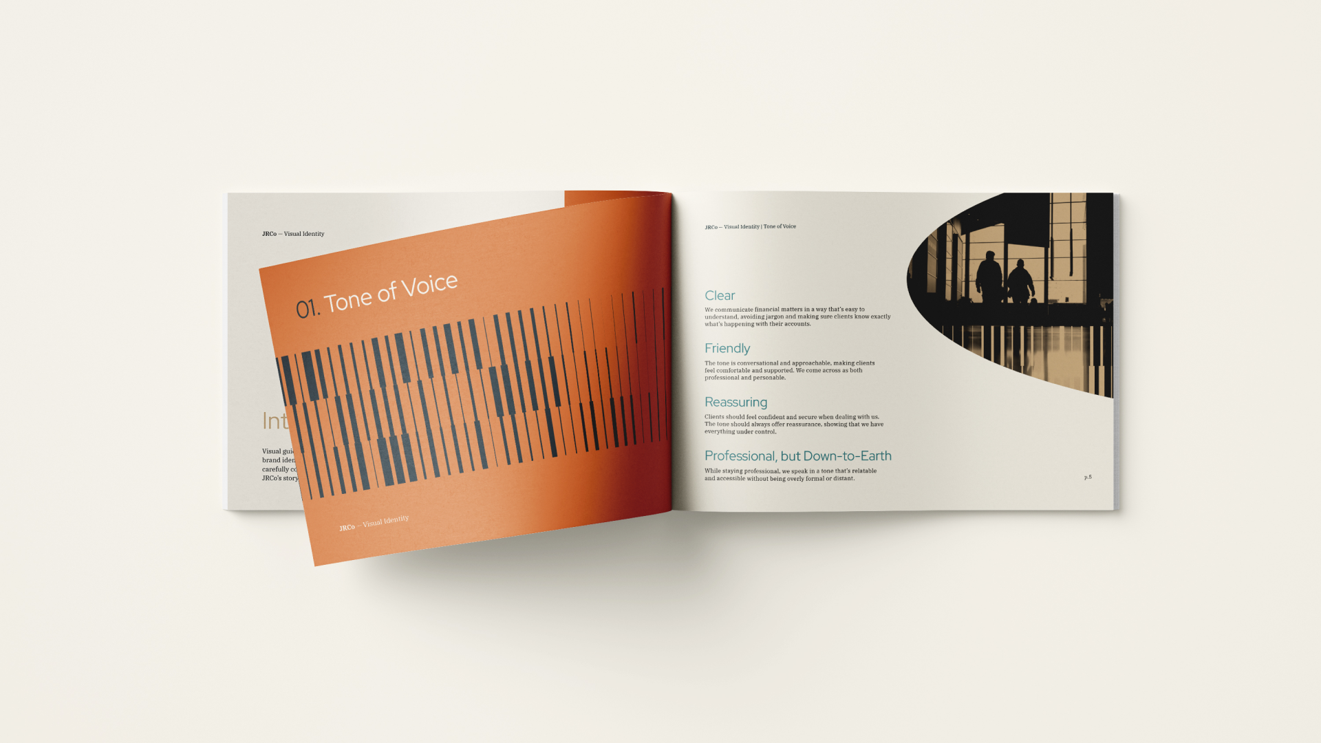
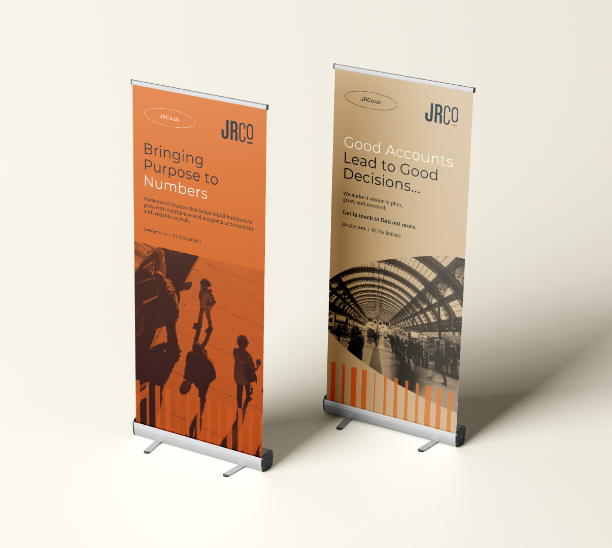
Through discovery sessions (and a few great chats), we unearthed Joe’s twin passions – finance and music – and used them to shape his new identity. We designed a visual language inspired by both: the grooves around the edge of a coin, the shapes of piano keys, even a falling coin doubling as a musical note. Nice. And unmistakably JRCo.
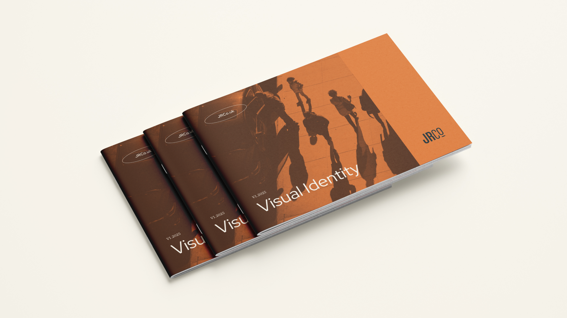
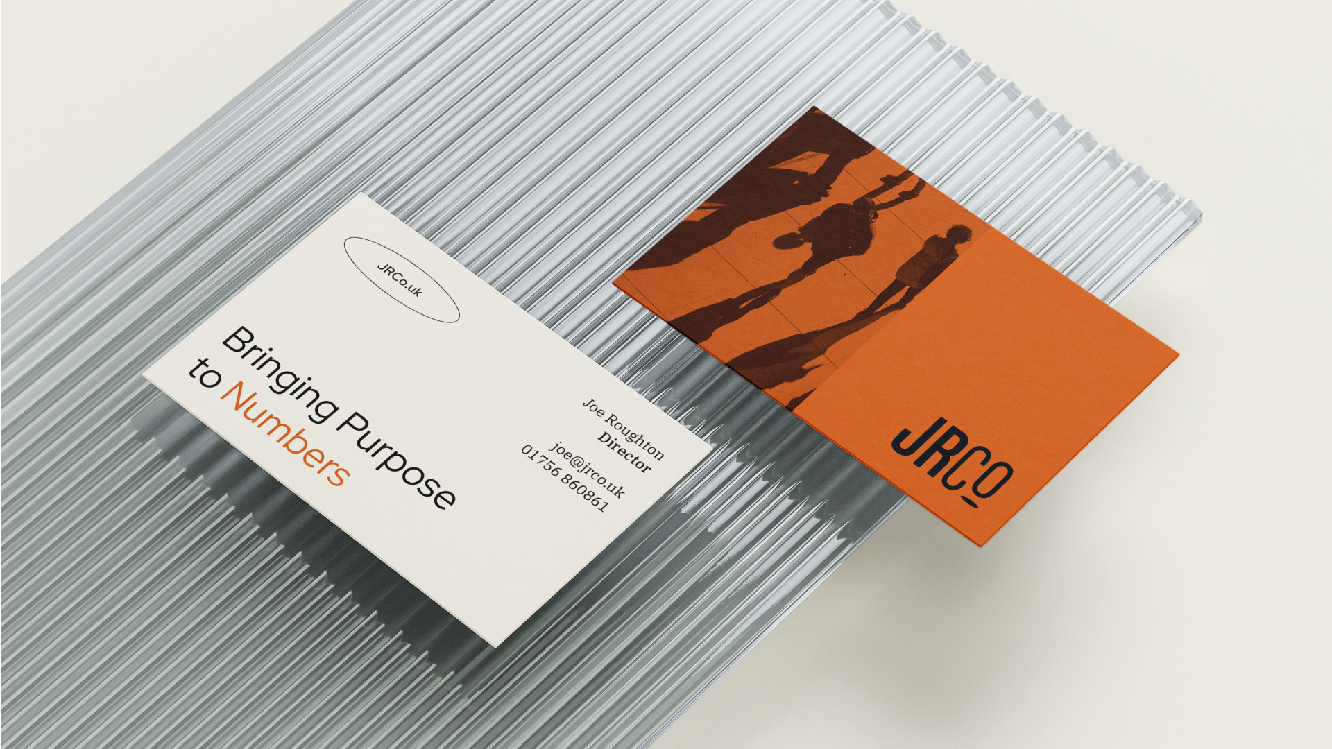
To reflect Joe’s warm and approachable personality, we moved away from the usual corporate cool tones and introduced a richer, friendlier colour palette – giving JRCo an eye-catching look in a normally conventional sector.
We love a good collaboration and we’re always open to white-label projects or creative cross-pollination. Drop us a line

