Logo Design | Visual Identity | Content | Branding | Web
NATIONAL FLOOD FORUM
CLEAR NEW LOOK FOR VITAL NATIONAL CHARITY
The National Flood Forum came to us for a simple website reskin - nothing too drastic, just a bit of a lick of paint.
But once we got under the skin of the project, it became clear that a visual tidy-up alone wasn’t going to be enough on its own.
The charity’s branding was aging, particularly the logo and colour palette, and wasn't keeping pace with the quality of the work they do, or with the modernised site we’re designing.
So, we gave their visual identity a bit of the Cubby treatment.
A reimagined identity
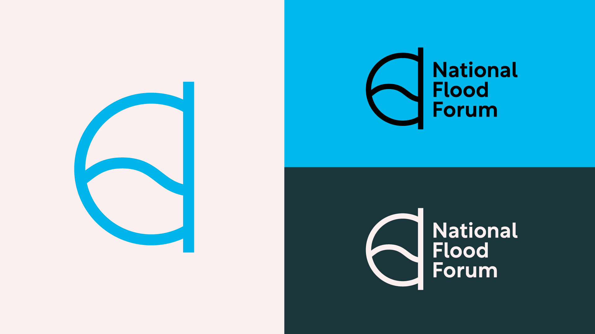
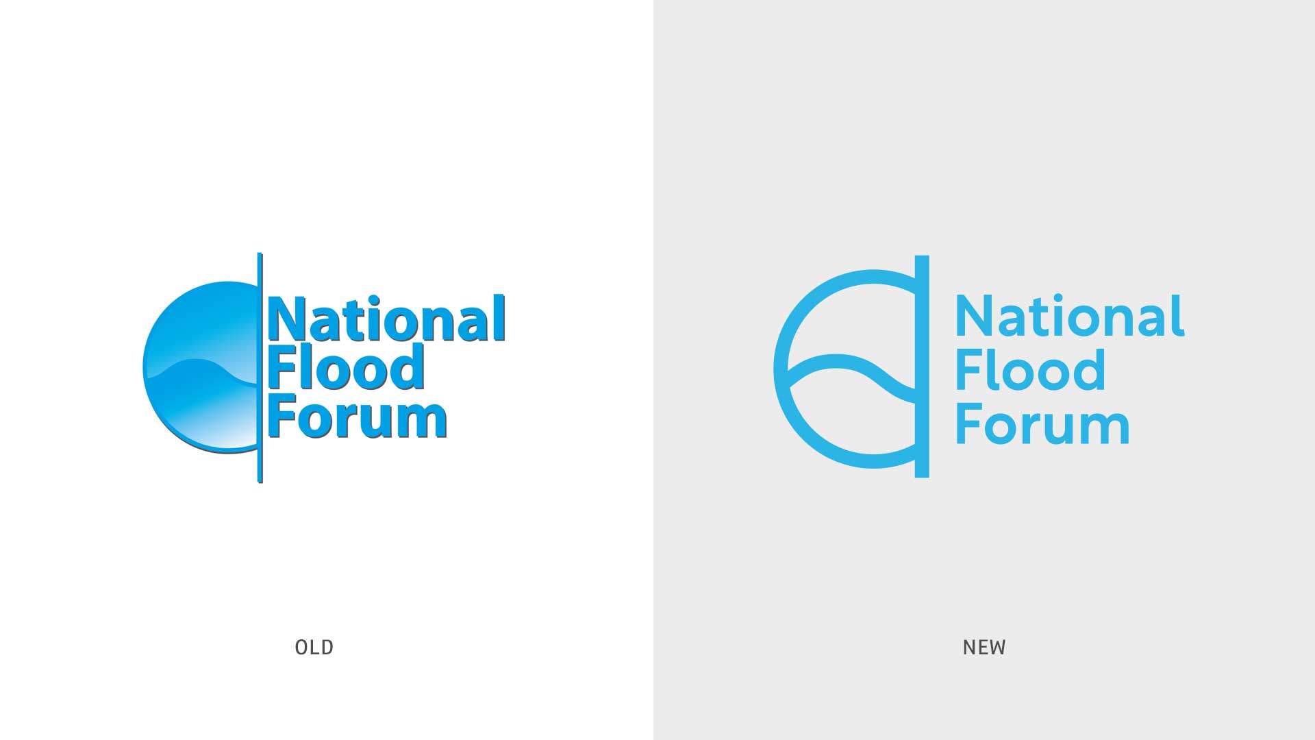
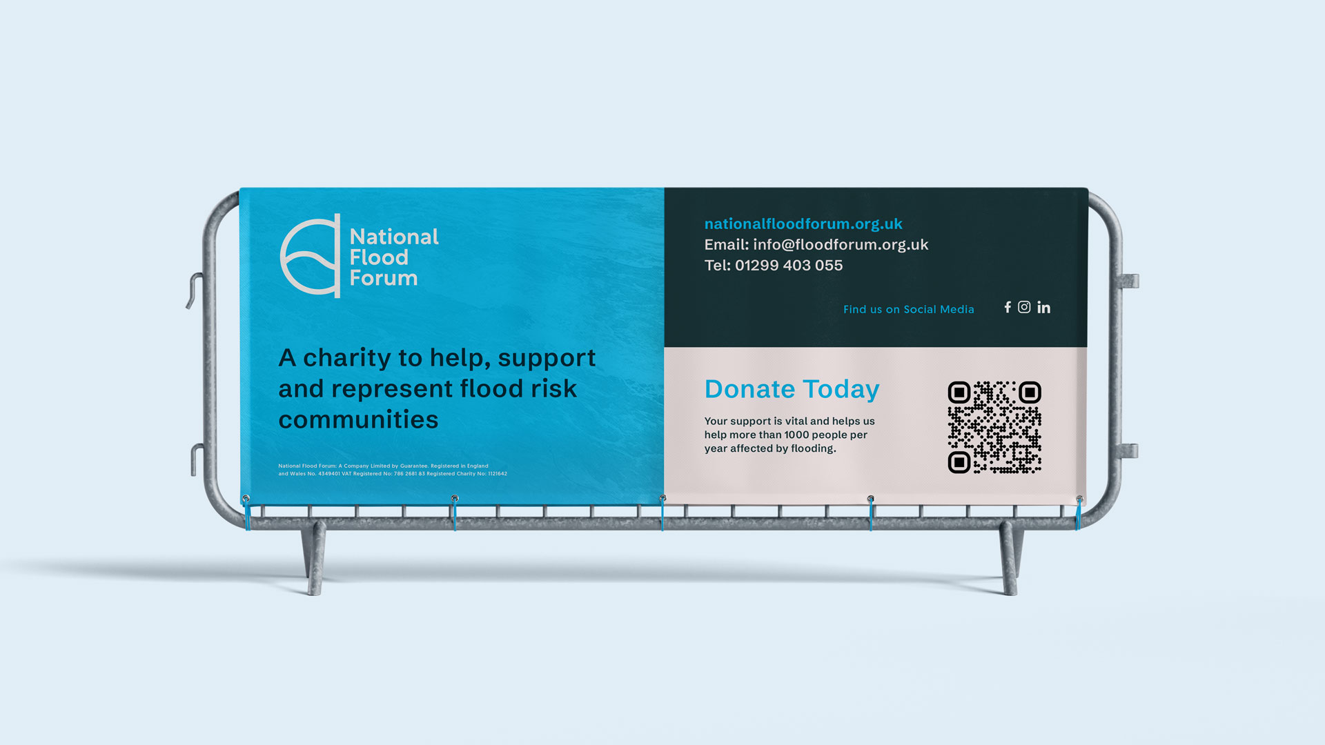
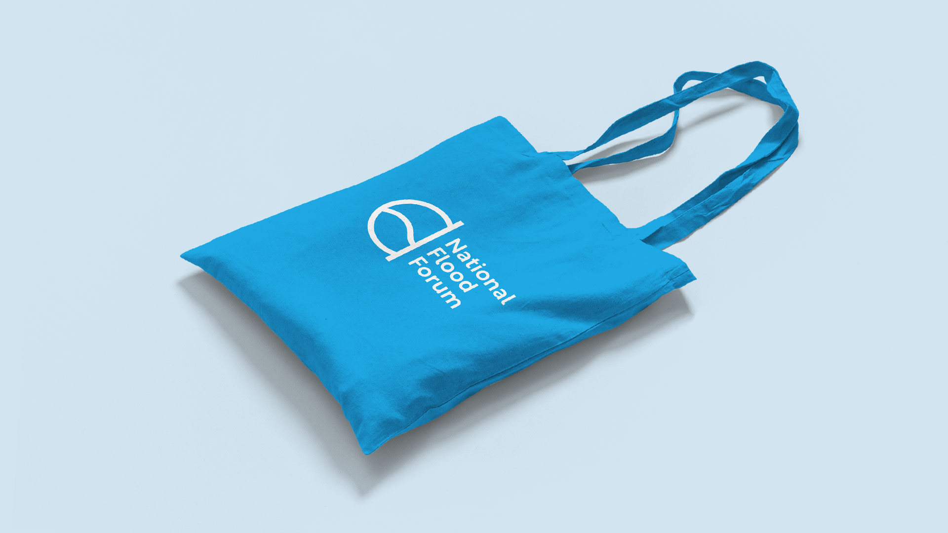
We created a clearer, more confident logo, removing gradients and drop shadows, streamlining the design, and improving accessibility across the board (actually we produced several, then worked closely with them to select the right variation)
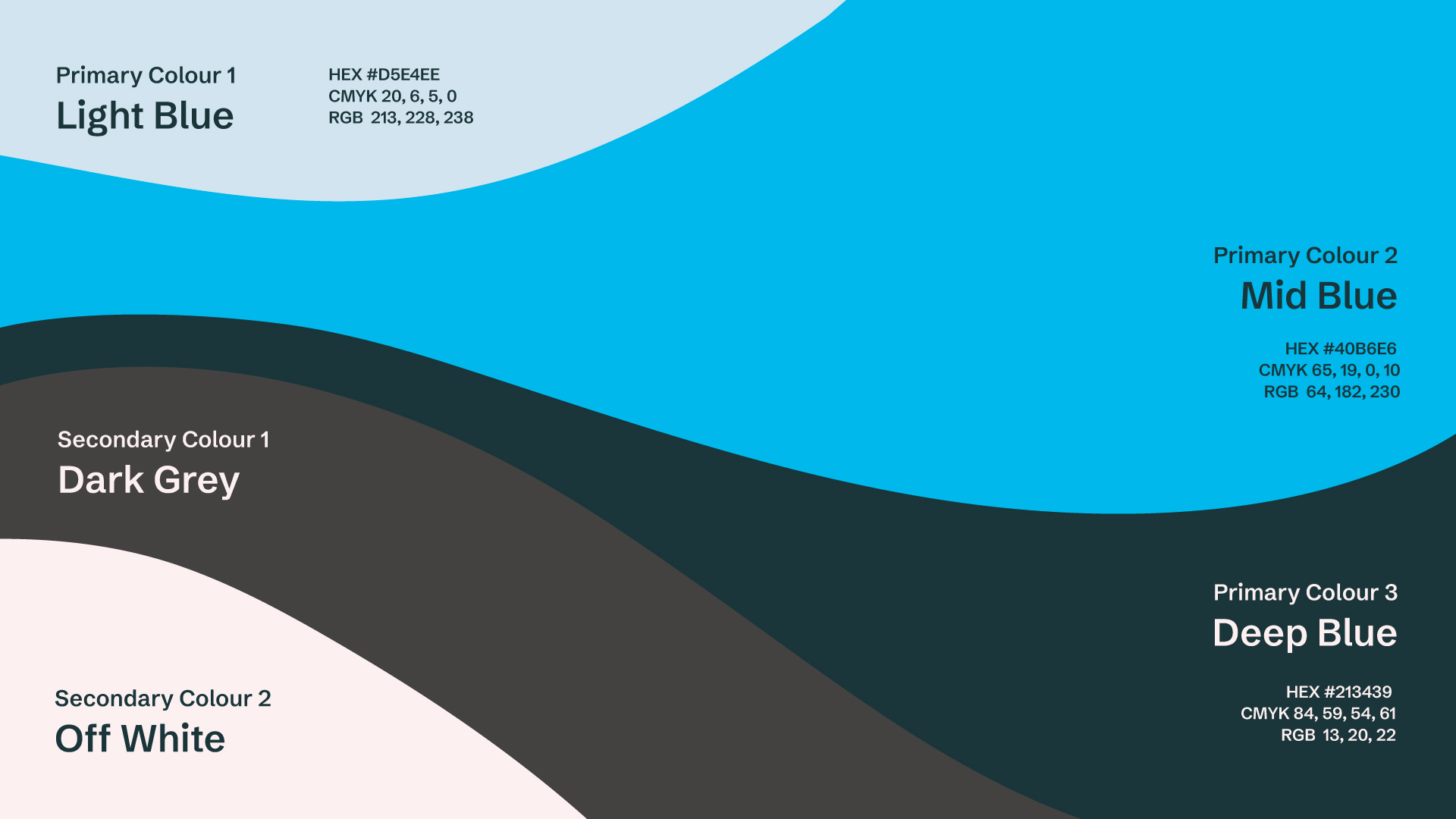
We also clamped down on the multiple versions of the logo that existed, and indeed the various shades of blue that were floating around.
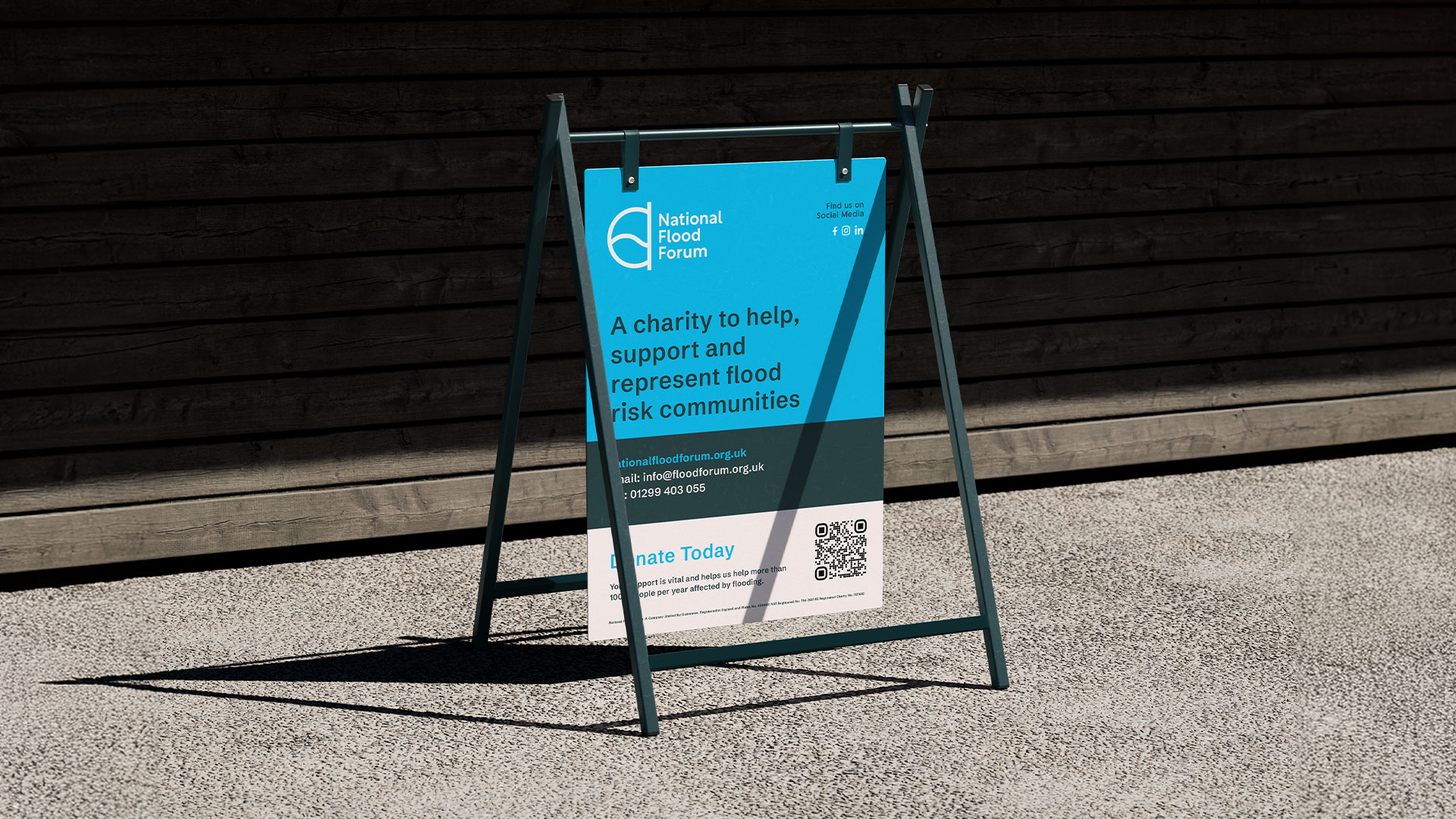
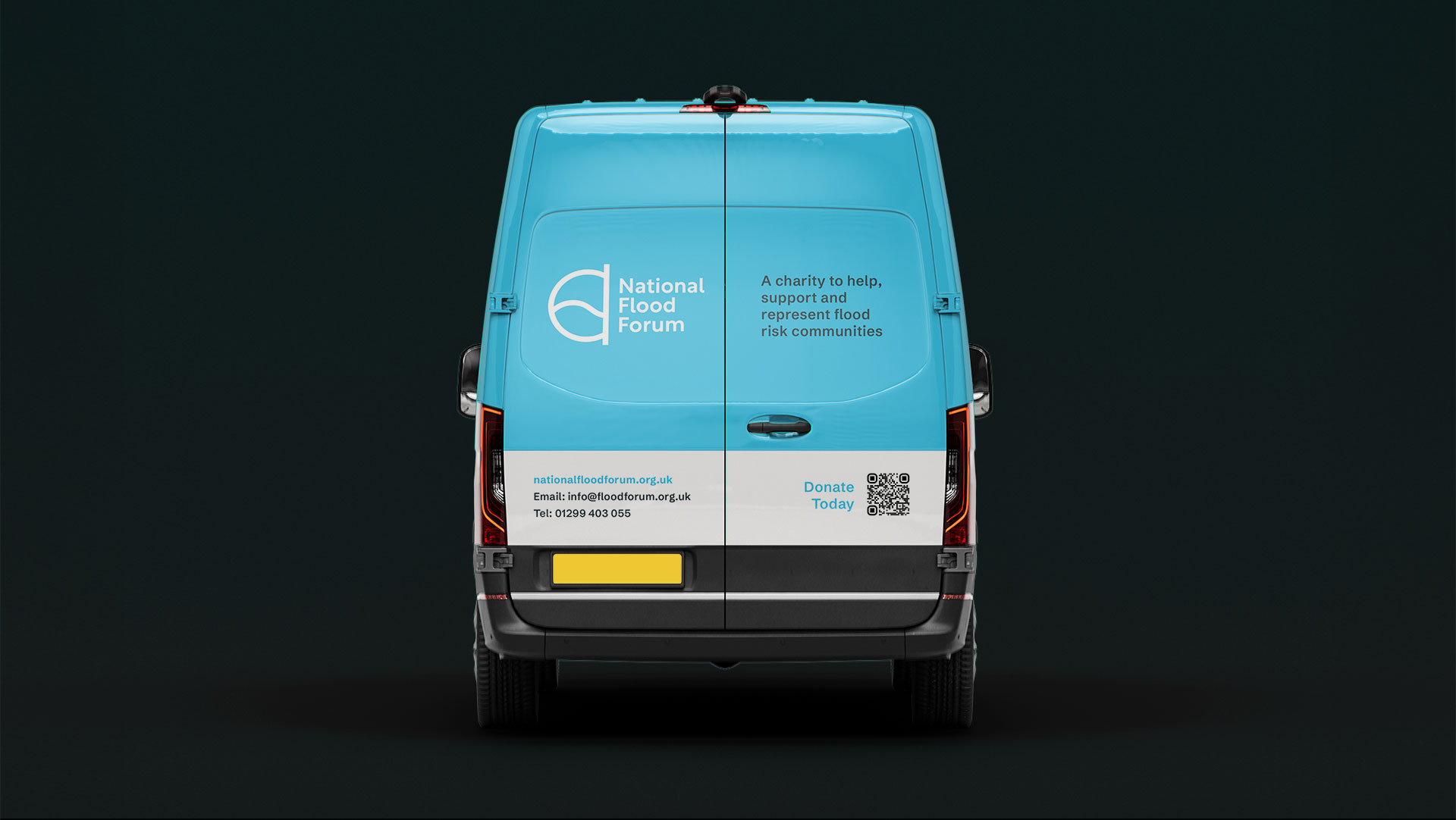
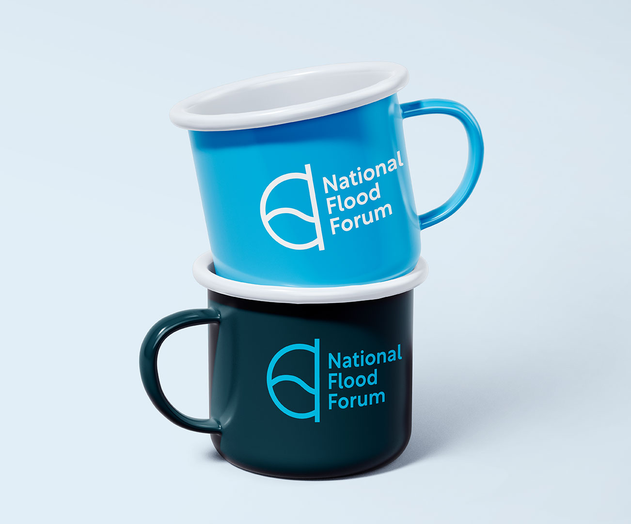
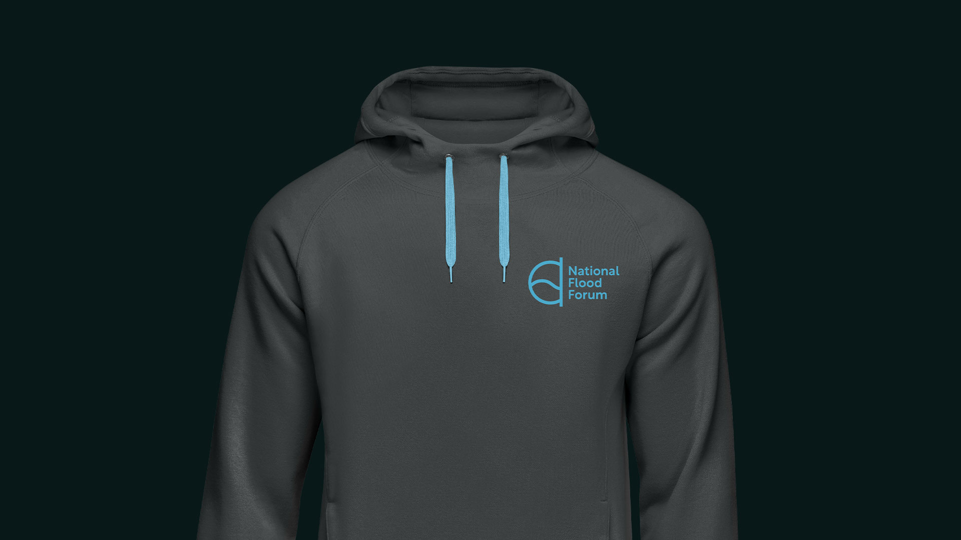
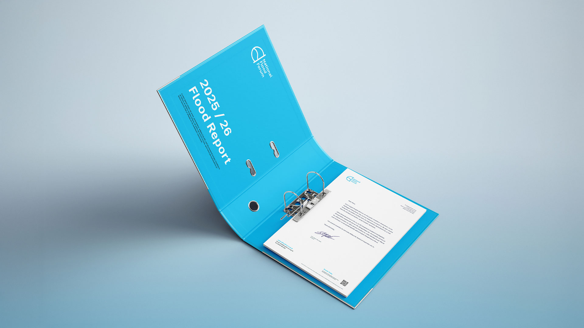
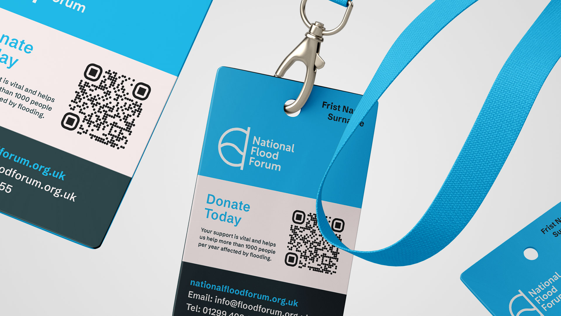
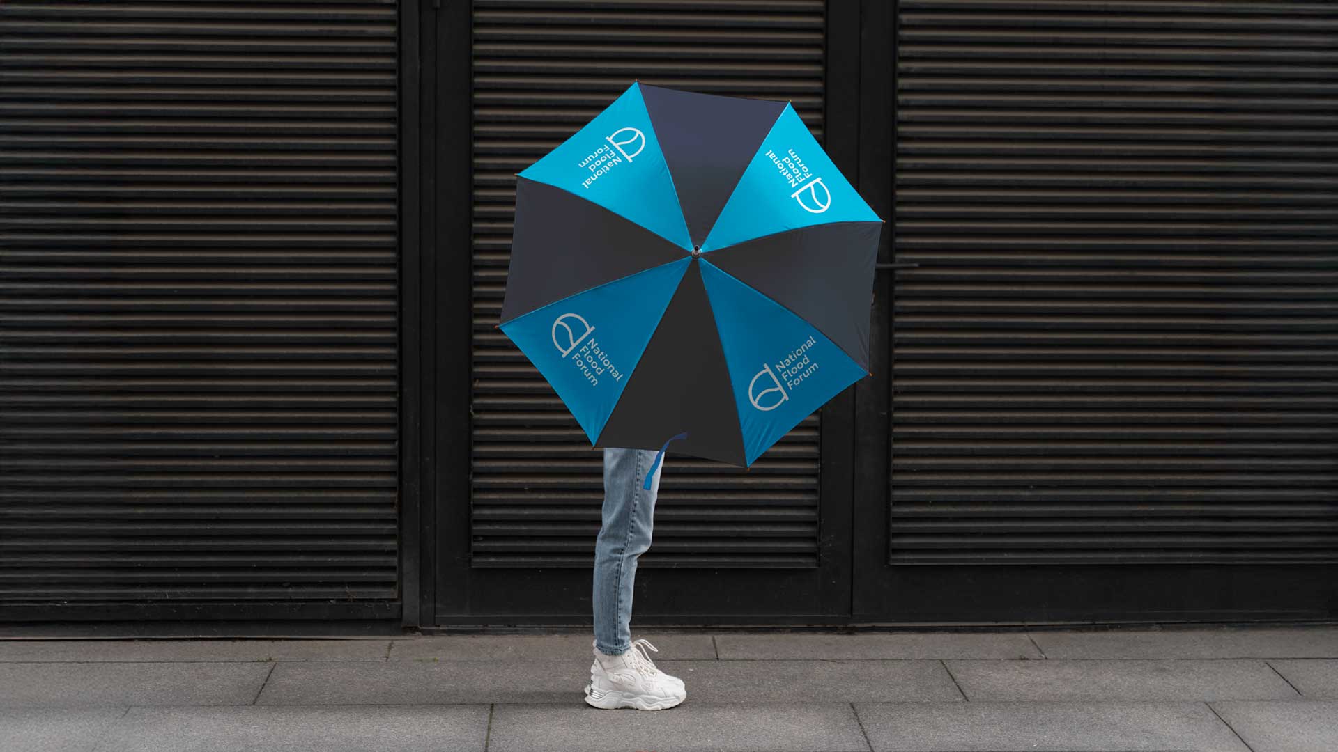
Instead, a clean, modern logo that works just as well on a website header as it does on a van, uniform or business card.
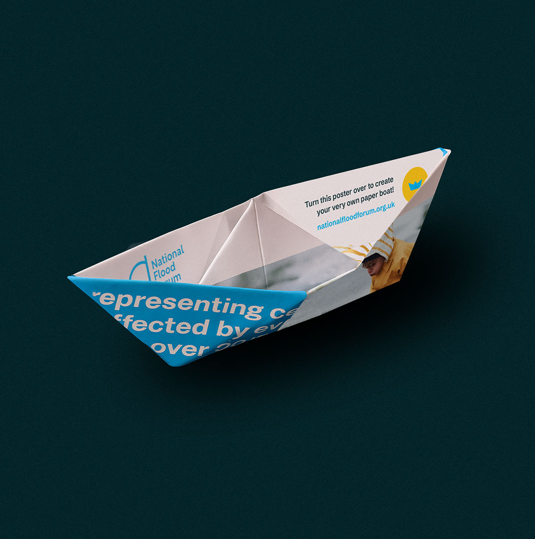
We introduced a refined colour palette that’s practical, purposeful, and easy to apply, in turn bringing unity across all National Flood Forum channels, from signage to social media.

THE RESULTS
We think this refresh has resulted in a national charity brand that reflects who they are today - contemporary, consistent, and ready for anything (even a flash flood).
It wasn’t a full reinvention, but we feel we helped them see themselves more clearly (now the rain has gone)
